Wordmark
The Aptive wordmark is the primary identifier of our brand. The wordmark is in LL Brown – Bold, with custom modifications and optical kerning. Both the descender of the “p” and ascending tittle are shortened and lowered, respectively, for a more compact feel to benefit the scalability of our wordmark. This also provides a convenient means for true centering within a space.
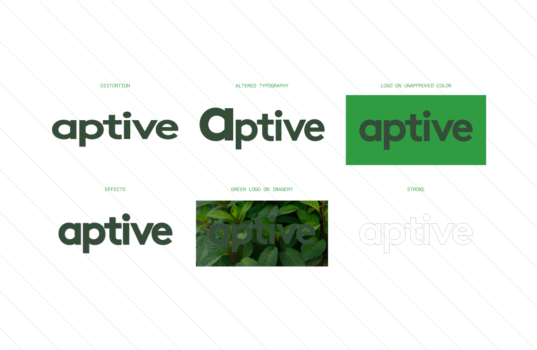
The vector wordmark file should be used for all instances of the logo, to maintain consistency in letter spacing. The wordmark should not be typed out in LL Brown – Bold.
The openness of the letter forms present a geometric and rhythmic balance in the wordmark. It expresses an approachable, unobtrusive, and welcoming form.
Logo Guide
For convenience, the “a” is your reference for spacing.
Don’ts
When in doubt, consult Aptive’s creative team.


